Charts of the Day - June 30, 2022
- Konstantinos Tzavras, CIO
- Jun 30, 2022
- 3 min read

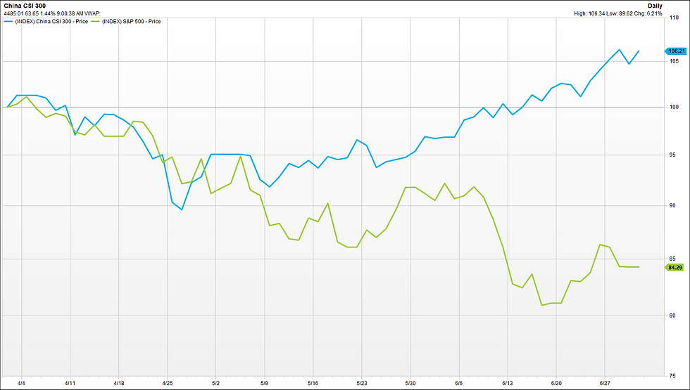
Chart 1. Chinese Equities significantly out-perform the US during the 2nd quarter

Few people would have thought three months ago, that there would be such a significant divergence between Chinese and US equities. The blue line is the performance of China's CSI300 Index with a positive 6% during the last three months. The green line is the performance of the S&P500, with a negative 16% in the same period, an absolute difference of 20%. But, the Chinese economy looks to be ahead in the economic cycle vs. its western peers. It passed through its own mini recession (economic slowdown) in 2021, but its low inflation and solid fiscal balance allow the central bank to be able to lower interest rates and offer stimulus to the economy, at a time when Europe and the US are raising interest rates, during their upcoming economic slowdown.
Chart 2. The S&P500 is having its worst 1st half since 1970.

The S&P500 is having its worst first half of a year since the 1970s. And if one looks even further back, the 20% drop since January is among the top-5 worst drops. We wrote back in December whether the FED will spoil the party in 2022. We now see it finally did. If history is any guide, the second half might be a lot better, but volatile and difficult times still lie ahead, until we get a clearer picture of corporate earnings and how these will be affected by the economic slowdown or recession.
Chart 3. One Euro today buys less than one Swiss Franc.

The EUR at its peak was worth almost 1.7 Swiss Francs (CHF), in 2007. It has been a downhill road since then and 15 years later we are seeing the EURCHF at 0.99, which means that the Swiss Franc is now worth "more" than the Euro. Admittedly, we saw the EURCHF below 1.0 back in 2015, when the Swiss Central Bank abandoned the virtual floor of 1.200, but that trip below parity lasted for only a few minutes, until the market realized that hit it. Now it looks that we have entered a prolonged period of sustainable CHF strength vs the common currency.
Chart 4. European fixed income investments give again income.

The blue line represents the yield that the index of European investment grade bonds offer for an average duration of about 5 years, if one invested today. Today, this yield is at almost 4% as one can see in the chart. The same bonds were yielding only 0.5% one year ago and less than 1% three years ago. And last time an investor could find a quality bond in EUR yielding almost 4% was in 2012, ten years ago. Maybe we are in front of one of the biggest investment opportunities in EUR Fixed Income of the last decade. Hard to ignore.
Disclaimer
• The content of this document has been produced from publicly available information as well as from internal research and rigorous efforts have been made to verify the accuracy and reasonableness of the hypotheses used. Although unlikely, omissions or errors might however happen.
• The data included in this document are based on past performances and do not constitute an indicator or a guarantee of future performances. Performances are not constant over time and can be positive or negative.
• This document is intended for informational purposes only and should not be construed as an offer or solicitation for the purchase or sale of any financial instrument and it should not be considered as investment advice. The market valuations, views, and calculations contained herein are estimates only and are subject to change without notice. Any investment decision needs to be discussed with your advisor and cannot be based only on this document.
• This document is strictly confidential and should not be distributed further without the explicit consent of Kendra Securities House SA.
Sources of the charts: Factset S.A.


Comments